
Some colors grab the eye instantly while others fade into the background. Bright red demands attention from across a room. Neon yellow shouts louder than any other hue. High-contrast combinations like black and white create visual urgency that the brain cannot ignore. Understanding what colors attract people’s attention most helps you guide viewers exactly where you want them to look.
The human eye processes certain wavelengths faster than others. According to Science Daily’s research on color perception, red and yellow-green trigger the fastest neural responses. A crimson jacket or lime accent piece becomes impossible to overlook. This biological fact explains why stop signs, emergency vehicles, and warning labels share similar color families.
For practical applications in family photography, understanding these attention principles helps you decide which family member should wear which color. For complete wardrobe planning explore:
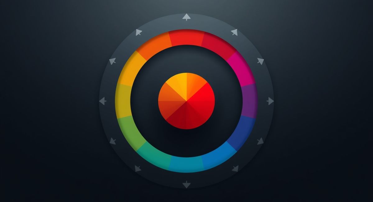
1. Red Commands Immediate Visual Priority
Red holds the top position for attention-grabbing power. A fire engine red dress pulls focus from everything else in the frame. The human brain processes red faster than any other color. This evolutionary trait helped ancestors spot ripe fruit and detect blood or danger.
Crimson creates a similar effect but with slightly less intensity. Scarlet demands attention in both natural and artificial light. Burgundy attracts the eye but feels more sophisticated and less urgent. A single red accessory like a red scarf or red shoes creates a focal point without overwhelming the entire composition.
For family photos, use red sparingly. One person wearing red becomes the star. Multiple people in red create visual competition. The eye jumps back and forth unable to settle.
2. Neon Yellow and Lime Green Shout Loudest
These fluorescent shades reflect ultraviolet light that human eyes detect as extremely bright. A neon yellow vest appears to glow even in shade. Lime green activates peripheral vision faster than almost any other color. Road workers and emergency personnel wear these hues for exactly this reason.
Highlighter yellow creates a visible halo effect around the person wearing it. This optical illusion makes them pop out from backgrounds and other people. Chartreuse (yellow-green) sits at the peak of human visual sensitivity. Our eyes have more receptors for this wavelength than any other.
Use these colors as strategic accents not main outfits. A neon yellow belt or lime green sneakers draws the eye exactly where you want it. Full outfits in these shades overwhelm everything else.
3. High-Contrast Black and White Creates Visual Urgency
Black next to white produces the highest luminance contrast possible. A black and white striped shirt activates the brain’s edge-detection circuits immediately. Checkerboard patterns and bold polka dots exploit this same biological mechanism.
Monochromatic outfits (all black or all white) do not grab attention the same way. The contrast between light and dark creates the urgency not the individual colors themselves. A white blouse against black pants draws the eye up toward the face. This makes black and white combinations popular for portrait photography.
For family coordination, limit black and white to one or two people. Too much contrast across the whole group creates visual chaos. The eye bounces between multiple high-contrast points unable to rest. Learn more about contrast balance in:
4. Orange Commands Attention Without Aggression
Orange sits between red and yellow on the spectrum. It carries urgency from red and brightness from yellow. Burnt orange attracts attention but feels warm and approachable. Tangerine pops against green backgrounds like grass or trees.
Terracotta works beautifully for outdoor portraits where autumn leaves or desert landscapes provide complementary backdrops. Coral grabs attention during summer beach sessions against blue water and sky. Amber glows beautifully during golden hour photography.
Orange works well as a statement color for one family member. A child in orange sweater becomes a charming focal point without looking aggressive. Parents in neutral tones allow the orange to shine without competition.
5. Magenta and Hot Pink Demand Feminine Focus
These pink-purple shades attract attention while reading as distinctly feminine in Western cultures. Magenta registers faster than pastel pinks because of its higher saturation. Hot pink became iconic in fashion and marketing precisely because people cannot look away from it.
Fuchsia commands the eye in both natural landscapes and urban settings. Against greenery, fuchsia pops dramatically. Against neutral walls, it becomes the undeniable focal point. Raspberry offers similar attention-grabbing power with slightly more sophistication.
Use these colors for accent pieces not full outfits. A magenta handbag or hot pink headband draws the eye exactly where you want it. Full magenta dresses overwhelm the frame and cast pink light onto nearby faces. For softer pink alternatives, read:
6. Royal Blue Commands Respectful Attention
Blue generally recedes rather than grabs attention. But royal blue and cobalt break this rule. These deep saturated blues pull focus without the urgency of red or neon. Electric blue registers almost as fast as neon yellow in peripheral vision.
Sapphire creates a focal point that feels sophisticated rather than aggressive. Cerulean pops beautifully against autumn foliage or golden hour light. Ultramarine draws attention in both indoor studio settings and outdoor natural environments.
Royal blue works well for the main subject of any photo. A mother in cobalt dress becomes the natural focal point with family members in softer blues or neutrals around her. This creates hierarchy without visual shouting.
7. Quick Reference: Attention Colors by Intensity
| Color | Attention Level | Best Use | Avoid |
|---|---|---|---|
| Red | Extreme | Single accent piece | Multiple people |
| Neon yellow | Extreme | Small accessories | Full outfits |
| Lime green | Extreme | Safety/emergency theme | Formal portraits |
| Black + white | Very high | One or two people | Whole group |
| Orange | High | Statement piece | Clashing with red |
| Magenta | High | Feminine accent | Casting pink light |
| Royal blue | Medium-high | Main subject | Dark backgrounds |
| Crimson | Medium-high | Sophisticated focal point | Bright sunlight |
8. How to Use Attention Colors Strategically
For family photos: Choose ONE attention color for the whole group. Let one person wear red or royal blue. Dress everyone else in muted neutrals like cream, navy, olive, or charcoal. This creates visual hierarchy. The eye knows exactly where to look first.
For product photography: Use red or orange for call-to-action buttons. Use royal blue for trust elements like guarantees or certifications. Use high-contrast black and white for pricing or sale announcements.
For social media: Neon yellow and lime green stop scrolling thumbs. Magenta and hot pink perform well for beauty and fashion content. Red drives clicks and engagement across all platforms.
The Professional Photographers of America recommends limiting attention colors to 10-15% of the total frame. Any more than that and the visual impact dilutes. Less truly becomes more when commanding attention.
9. Final Thoughts
Pair your attention-grabbing color strategy with golden hour lighting and natural posing techniques for professional results. A red dress at sunset creates magic. The same red dress at noon creates chaos. Timing matters as much as color choice.