
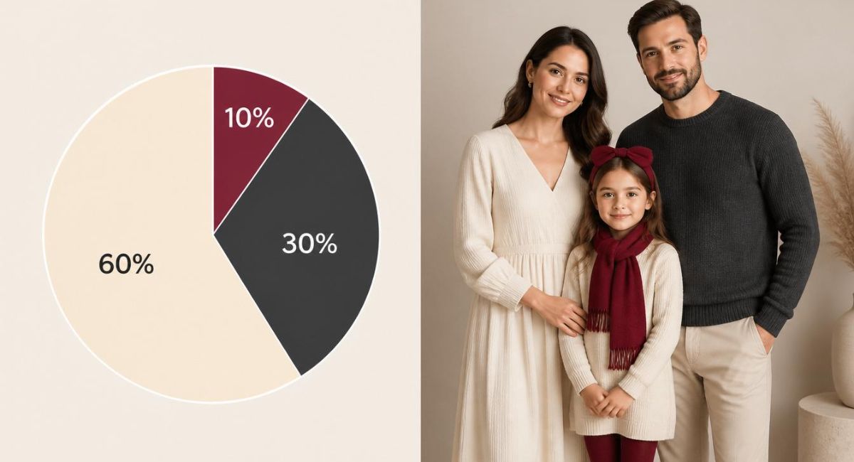
Limit your palette to three colors. That is the entire rule. Choose a dominant color (60% of the frame), a secondary color (30%), and an accent color (10%). This simple what is the 3 color rule in photography formula creates visual harmony that professional photographers use for portraits, family sessions, and editorial work.
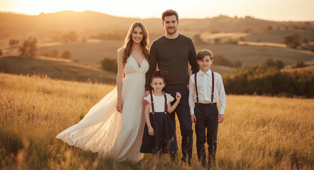
The 3 color rule prevents visual chaos. Too many colors compete for attention. Too few colors look boring. Three colors hit the sweet spot where the eye moves comfortably across the image without feeling overwhelmed or understimulated. According to color theory research from the Interaction Design Foundation, this 60-30-10 ratio appears naturally in successful paintings, films, and photographs across centuries. A navy blue dress (dominant), cream cardigan (secondary), and burgundy scarf (accent) create a perfect trio. For complete wardrobe planning, Explore:
1. The 60% Dominant Color Anchors the Entire Image
The dominant color covers most of the frame. In family photos, this often means the background or the largest clothing pieces. A cream-colored wall behind the family or a navy dress on the central person establishes this primary hue.
Choose your dominant color wisely. It sets the mood for everything else. Warm neutrals (cream, beige, taupe) create soft approachable images. Deep blues and charcoal grays add sophistication and drama. Olive green works beautifully for outdoor natural light sessions.
The dominant color should never scream for attention. It provides the foundation. Think of it as the canvas before the paint. A beige sofa in a living room portrait or a green field in an outdoor session serves this anchoring purpose perfectly. Find dominant color inspiration in
2. The 30% Secondary Color Adds Depth and Interest
The secondary color appears about half as much as the dominant color. This usually comes from additional clothing pieces or significant background elements. A charcoal sweater worn over a cream dress or wooden furniture next to a beige wall fulfills this role.
Secondary colors should complement not compete. If your dominant color is cream, try charcoal or olive as your secondary. If your dominant is navy, reach for cream or burgundy. The secondary color creates contrast without creating chaos.
In group photos, the secondary color often dresses the supporting family members. Parents in secondary colors while the child wears the accent creates natural visual hierarchy. The eye knows exactly where to land first. Learn more about color layering in
How to Identify Your Secondary Color
Stand back from your image and squint. The color you notice after the dominant one is your secondary. It should feel intentional not accidental. A burgundy blanket draped over a cream chair or olive pants paired with a navy top both work beautifully as secondary elements.
3. The 10% Accent Color Creates Excitement
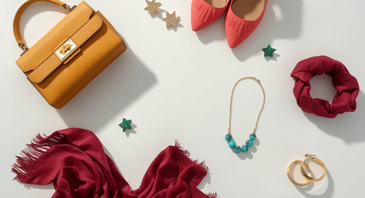
The accent color appears in small doses. A mustard yellow handbag, coral pink shoes, or turquoise necklace adds the spark that makes images memorable. Without this tiny pop of contrast, photos risk feeling flat or monotonous.
Accent colors should surprise but not shock. Choose a hue opposite your dominant color on the color wheel. Cream (warm neutral) pairs beautifully with burgundy (cool red) or sage (green). Navy (cool) pops wonderfully with mustard (warm yellow) or rust (warm orange).
Use accent colors on small accessories only. A bright red hair ribbon on a child, emerald earrings on mom, or teal socks peeking from dad’s loafers. The accent should never overwhelm the frame. The Professional Photographers of America teaches that the best accent colors occupy less than 10% of the total image area.
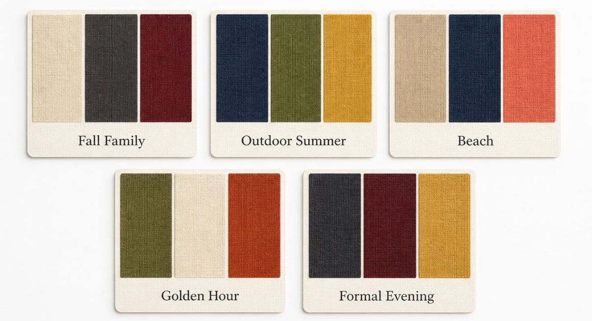
4. Examples of the 3 Color Rule in Action
| Dominant (60%) | Secondary (30%) | Accent (10%) | Best For |
|---|---|---|---|
| Cream | Charcoal | Burgundy | Fall family photos |
| Navy | Olive | Mustard yellow | Outdoor summer sessions |
| Beige | Navy | Coral pink | Beach portraits |
| Olive | Cream | Rust | Golden hour shoots |
| Charcoal | Burgundy | Gold | Formal evening portraits |
| Sky blue | White | Navy | Spring maternity photos |
5. How to Apply the 3 Color Rule to Family Groups
Start with the background. A green field (dominant) dictates everything else. Dress the family in cream (secondary) with small navy accessories (accent). Start with the largest clothing piece. If mom wears a navy dress (dominant), dress dad in cream (secondary) and children in outfits with small burgundy details (accent).
Coordinate don’t match. The 3 color rule works across multiple people. Everyone wearing different shades of the same three colors creates cohesion without looking costumey. One person in navy, another in cream, a third in burgundy. All three colors appear across the group.
Avoid adding a fourth color. That fourth hue breaks the rule and introduces visual noise. If your palette includes cream, navy, and burgundy, skip the olive scarf. Save it for another outfit. Find coordination tips in:
- Engagement Photo Outfits: Stunning Couples Guide for Picture-Perfect Memories
- Senior Picture Ideas 2026: Outfits Poses and Locations That Wow
6. What Happens When You Break the Rule?
| Number of Colors | Result |
|---|---|
| 1 color | Boring, flat, lacks dimension |
| 2 colors | Safe but unexciting |
| 3 colors | Balanced, harmonious, professional |
| 4+ colors | Chaotic, distracting, amateur |
Too many colors make the eye bounce frantically. Viewers cannot settle on any single focal point. The image feels stressful rather than peaceful. This is why real estate photographers style rooms with three-color palettes and why film directors limit costume colors to three hues per scene.
7. The 3 Color Rule Works for Every Photography Genre
Family photos benefit from cream, navy, and olive. Engagement portraits shine with beige, burgundy, and gold. Senior pictures pop with charcoal, white, and emerald. Newborn sessions feel calm with cream, blush, and sage.
The rule scales from individual portraits to large group shots. It works indoors and outdoors. Natural light or studio strobes make no difference. Three colors always create more pleasing images than four, five, or six.
For seasonal applications, explore:
- Spring Family Photo Outfits 2026: Fresh Stylish Ideas for Blooming Portraits
- Summer Family Photo Outfits: Light & Airy Styles That Photograph Beautifully (2026)
- Fall Family Photos: Stylish Outfit Ideas That Look Stunning & Elegant
- Winter Family Photo Outfits: Cozy Elegant Looks That Keep You Warm and Photogenic
8. Quick Reference: The 3 Color Rule Formula
| Step | Action | Example |
|---|---|---|
| 1 | Pick a dominant color (60%) | Cream wall or navy dress |
| 2 | Pick a secondary color (30%) | Charcoal sweater or olive pants |
| 3 | Pick an accent color (10%) | Burgundy scarf or gold earrings |
| 4 | Eliminate all other colors | No green, no pink, no purple |
9. The Bottom Line
The 3 color rule simplifies every photography decision. Choose one dominant color for 60% of the frame. Add a secondary color for 30%. Finish with an accent color for 10%. No more. No less. This formula works for family photos, engagement sessions, senior portraits, and everything in between.