
Choosing what to wear for engagement pictures is one of the most exciting decisions you will make during your engagement planning — and also one of the most overwhelming. You want to look like yourselves, feel genuinely comfortable, and still have outfits that translate beautifully when captured on camera. The pressure to get it right is real because these photos will stay with you for the rest of your lives.
The good news is that with the right understanding of color, fit, coordination, and a few insider styling principles, your engagement photos can look completely effortless and stunning — without spending thousands on wardrobe. This guide covers everything you need to know, from the best colors for engagement photos to what fabrics photograph well, how to coordinate outfits as a couple, nail color choices, what to absolutely avoid, and practical tips for the day of your session.
By the time you finish reading, you will know exactly what to wear for engagement pictures and feel completely confident walking into your session.
1. Why Your Outfit Choice Matters More Than You Think
Most couples invest significant time choosing their photographer and scouting the perfect location, but leave outfit planning to the last few days before the session. This is one of the most common — and most avoidable — mistakes in engagement photo preparation.
Your clothing directly shapes the mood, tone, and timelessness of your engagement photos. The wrong outfit can clash with your background, create unflattering silhouettes, introduce distracting visual noise, or pull the viewer’s eye away from your faces and your connection as a couple. The right outfit, on the other hand, becomes invisible in the best possible way — it simply frames you both beautifully and lets your genuine emotion take center stage.
Professional photographers consistently identify outfit choices as one of the top factors separating truly stunning engagement photos from forgettable ones. Color coordination between partners, how clothing interacts with the shooting location, and whether the fit is genuinely flattering all contribute directly to how your final images feel.
There is also a longevity factor worth considering. Trendy, of-the-moment outfits can look dated within just a few years. Classic, well-fitted pieces in flattering colors age gracefully and feel just as beautiful a decade from now as they do today. Thinking about timelessness from the beginning will make a meaningful difference in how you feel about these photos years down the line.
2. The Best Colors to Wear for Engagement Photos
Color is the single most impactful element of your engagement photo outfit. The best colors for engagement photos share three qualities — they complement your skin tone naturally, work harmoniously with your partner’s outfit, and interact beautifully with your shooting location and the available light.
Soft Neutrals and Earth Tones
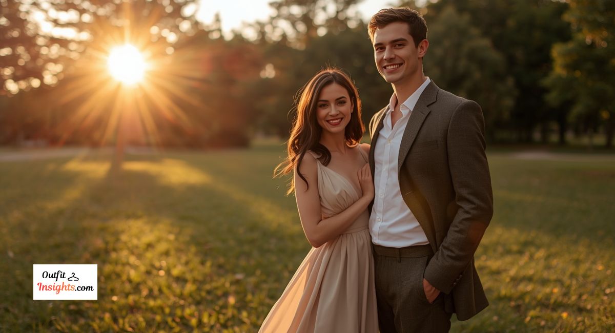
Soft neutrals are consistently the most flattering and universally recommended colors for engagement photography. Shades like ivory, cream, blush, taupe, sage green, dusty rose, and warm beige photograph beautifully across all lighting conditions. They feel romantic, timeless, and never distract from what matters most — your faces and your connection.
Earth tones — terracotta, warm brown, rust, and olive — are particularly powerful for outdoor sessions. These colors naturally echo the tones found in grass, trees, golden fields, and autumn foliage, creating a visual cohesion that makes your photos feel cinematic and intentional rather than staged.
Muted and Dusty Tones
Muted versions of colors consistently outperform their saturated counterparts in photography. Dusty blue, muted mauve, faded lavender, and soft teal all photograph with an elegance that their bright counterparts cannot match. When a color is too vivid or saturated, it dominates the frame and pulls attention away from everything else.
This is one of the most overlooked color principles among couples planning their engagement sessions. Always choose the quieter, more toned-down version of a color over the bold, vivid version. Your photos will look more balanced, more polished, and more timeless as a result.
Classic White and Off-White
White remains a popular and genuinely beautiful choice for engagement photos, particularly for beach, garden, or studio sessions. It feels clean, fresh, and romantic. However, pure bright white can sometimes overexpose in direct sunlight and lose all fabric texture and detail.
Off-white, ivory, and cream are slightly safer alternatives that still read as white in finished photos but hold their dimension and texture far better. If one partner chooses white, the other should avoid white entirely — slight differences between white tones can look unintentional and subtly off in final images. Pair white instead with a warm neutral like sand beige, light grey, or soft champagne.
Jewel Tones for Fall and Winter Sessions
For fall and winter engagement photos, jewel tones can look absolutely extraordinary. Deep burgundy, forest green, navy, and plum are rich, warm colors that pair beautifully with autumn foliage, rustic wooden settings, and the golden warmth of late-afternoon light. They feel sophisticated and elevated while retaining genuine warmth and personality.
For fall engagement shoots specifically, consider pairing a deep burgundy dress with a partner in navy or charcoal. The interplay between these rich tones photographs with a depth and warmth that lighter color pairings simply cannot replicate. For more fall-specific outfit and color inspiration, our fall family photos guide covers color coordination for outdoor autumn sessions in detail.
Color Comparison by Season
| Season | Best Colors | Colors to Avoid |
|---|---|---|
| Spring | Blush, mint, lavender, soft yellow | Neon brights, stark white |
| Summer | White, coral, sky blue, sage green | Heavy dark tones, busy prints |
| Fall | Burgundy, rust, forest green, mustard | Pastels, neon, bright white |
| Winter | Navy, deep plum, cream, forest green | Washed-out pastels, neon |
The Best Colors for Outdoor Engagement Photos
The best colors for outdoor engagement photos depend on the specific environment and the season in which you are shooting. The fundamental principle is to choose colors that complement your background rather than fight against it.
For lush green parks and forests, warm tones like rust, blush, cream, and terracotta create beautiful contrast against the greenery. For beach and coastal settings, soft blues, whites, and sandy neutrals feel visually connected to the environment. For urban locations featuring brick, concrete, and architectural geometry, you have considerably more flexibility — deeper colors like hunter green, mustard, or rich burgundy can create striking and intentional contrast.
Golden hour, the period of warm soft light in the hour following sunrise and before sunset, is the most flattering time for outdoor engagement photography. The quality of light during golden hour enhances warm tones especially — blush, rust, terracotta, and cream all glow beautifully in this light. You can learn more about maximizing natural light in our guide on golden hour and the best time to take pictures outside.
3. Can You Wear Black for Engagement Pictures?
This is one of the most frequently asked questions among couples planning their engagement sessions, and the honest answer is yes — with important and specific considerations.
Black is a sophisticated, slimming, and deeply timeless color. Many people feel their most confident and their most genuinely themselves in black clothing, and that confidence in front of the camera is not a small thing. However, black presents specific technical challenges in photography that are worth understanding before you commit to it.
In outdoor settings with bright natural light, black clothing creates a high contrast situation — particularly when your partner is wearing lighter tones. Camera sensors struggle to expose correctly for both tonal extremes simultaneously, which can result in dark clothing losing all texture and detail while lighter areas overexpose, or vice versa. A skilled and experienced photographer can manage this, but it adds a layer of complexity.
Black clothing also absorbs rather than reflects light, which can cause black outfits to look flat and dimensionless in photos rather than rich and dynamic. This effect is most noticeable in shaded or low-light environments.
If black feels right for you, here is how to make it genuinely work. Choose a black outfit with visible texture — lace overlays, velvet fabric, fine embroidery, or structured tailoring all add visual depth that plain black fabric lacks. Pair your outfit with a partner wearing a deep complementary tone like rich charcoal, burgundy, or navy rather than a stark contrast like bright white. Shooting during golden hour adds warmth and dimension even to darker clothing that flat midday light simply cannot provide.
Black absolutely can look stunning in engagement photos when the approach is thoughtful, the styling is considered, and the lighting conditions support it.
4. How to Coordinate Outfits as a Couple
Outfit coordination between partners is about creating visual harmony, not achieving a perfect match. Wearing identical outfits or precisely the same color reads as costume-like in photographs and lacks the natural, organic quality that makes great engagement photos feel authentic.
Use a Shared Color Palette
The most reliable and widely recommended approach is choosing two or three colors and distributing them thoughtfully across both outfits. If one partner wears a dusty rose dress, the other might wear a warm grey suit with a pocket square or accessory that echoes the blush tone. The colors speak to each other without being identical.
This shared palette approach creates visual cohesion that feels intentional without feeling rigid. It also preserves the individuality of each partner’s personal style, which is what makes the photos feel like a genuine portrait of your relationship rather than a styled advertisement.
Balance Light and Dark
A classic and consistently effective pairing places one partner in a lighter tone and the other in a deeper one. Light and dark naturally create visual contrast in photographs, provide balance across the frame, and consistently read as intentional and polished. Ivory with navy, blush with burgundy, cream with forest green — these combinations appear across professional engagement photography portfolios repeatedly because they simply work.
Avoid placing both partners in very dark tones or both in very light tones unless it is a fully deliberate stylistic choice. Two people in very dark clothing can create a heavy, visually flat image. Two people in very light clothing risks a washed-out effect depending on the brightness of the background.
Coordination Formula by Location
| Location Type | Partner One | Partner Two |
|---|---|---|
| Forest / Park | Cream or blush | Olive green or warm brown |
| Beach / Coastal | White or soft blue | Sandy beige or navy |
| Urban / City | Burgundy or mustard | Charcoal or deep grey |
| Fall Outdoors | Rust or terracotta | Navy or forest green |
| Studio | Soft ivory | Warm grey or dusty blue |
For deeper guidance on outfit pairing strategies and specific outfit formulas for different locations, our engagement photo outfits couple guide covers the full range of coordination approaches for every season and setting.
5. What Fabrics and Fits Photograph Best
Color attracts most of the attention during outfit planning, but fabric choice and fit quality are equally important factors that directly affect how your photos turn out.
Fabrics That Work Well on Camera
Flowy fabrics like chiffon, silk, and light linen create beautiful natural movement in outdoor photos. When a breeze catches a chiffon skirt or relaxed linen shirt during a session, the resulting images feel alive, dynamic, and genuinely romantic in a way that stiff, structured fabric simply cannot replicate. These materials drape elegantly and create naturally flattering silhouettes across a wide range of body types.
Textured fabrics like lace, velvet, tweed, and cable-knit add visual interest and depth that translate powerfully in photographs. They give the camera meaningful detail to work with and prevent the flat, featureless appearance that can occur with very basic, smooth fabrics.
Fabrics to Avoid
Small busy prints, thin stripes, houndstooth, and tight geometric patterns create a moiré effect in photographs — a distracting optical illusion of rippling or shimmering movement in the fabric that has nothing to do with how the garment actually looks in person. This effect is unpredictable and can be very difficult for a photographer to mitigate in post-processing. Subtle textures and solid tones are consistently safer choices.
Why Fit Changes Everything
Even the most carefully chosen outfit in a perfect, flattering color will look disappointing in photos if the fit is not right. Clothing that is too loose reads as shapeless and can add visual weight. Clothing that is too tight creates uncomfortable pulling lines and restricts the natural movement that makes engagement photos feel relaxed and authentic.
The goal is well-fitted clothing that allows you to move naturally — to sit comfortably, walk easily, embrace each other fully, and laugh freely without the outfit working against you. If you are buying something new for your session, even minor tailoring adjustments to a hem or a waistline can meaningfully change how an outfit photographs.
6. What to Avoid Wearing for Engagement Photos
Understanding what does not work in engagement photography is just as valuable as knowing what does. Certain choices consistently create problems regardless of how good they look in person or in a mirror.
Overly trendy statement pieces — heavily logoed items, very trend-specific silhouettes, and highly fashion-forward pieces that feel unmistakably of this particular moment — tend to age quickly. Since engagement photos are something you will display and revisit for the rest of your lives, erring toward classic styling is almost always the smarter long-term choice.
Neon and heavily saturated colors are extremely difficult for camera sensors to handle accurately. They tend to bleed color into surrounding areas of the image and cast colored light onto skin tones, creating an effect that is very difficult to correct in editing. Always choose the softer, muted version of a color over the neon or heavily saturated version.
Logos and large graphic prints draw the viewer’s eye immediately and persistently toward the graphic rather than toward your face and your partner. Keep clothing clean and free of prominent text and graphic elements.
Mismatched formality levels create visual imbalance. If one partner is in a formal floor-length gown and the other is in casual jeans, the disparity can make the couple look disconnected rather than harmonious. Both partners should be dressed at roughly the same level of formality, whether that is casual, smart-casual, or formal.
For a thorough breakdown of additional styling choices that consistently undermine photo results, our article on what to avoid wearing in family photos covers many of the same foundational principles that apply equally to engagement sessions.
6. Best Nail Colors for Engagement Photos
Your hands will be featured prominently and repeatedly throughout your engagement photo gallery. Ring shots, hand-holding poses, intertwined fingers, and close-up detail shots are standard elements of virtually every professional engagement session. Nail color deserves deliberate, intentional thought — not an afterthought.
Neutral and Nude Tones
Neutral nail colors are the safest and most universally flattering choice for engagement photography. Soft pink, nude beige, warm ivory, and sheer rose are all elegant without being visually distracting. These shades complement the engagement ring beautifully without competing with it, which is exactly the right balance for close-up ring shots.
Neutral tones also photograph consistently well across different lighting environments, from bright outdoor sunlight to soft indoor ambient light. They are a reliable, low-risk choice that consistently produces polished results.
Classic Red and Berry Tones
A true classic red nail is timeless, sophisticated, and photographs with a confidence and intentionality that many other colors cannot match. If red is genuinely part of your personal style, it can look absolutely stunning in engagement photos. Deep berry, wine, and burgundy shades carry similar elegance and are particularly well-suited to fall and winter sessions where they feel seasonally resonant.
The important factor is choosing a shade that genuinely complements your skin undertone. Warm-toned reds with orange undertones photograph beautifully on warm skin tones. Cool-toned reds with blue or pink undertones suit cooler complexions far better.
Nail Color Guide by Outfit
| Outfit Color | Recommended Nail Color |
|---|---|
| Blush / Dusty Rose | Nude pink or soft mauve |
| Ivory / Cream | Sheer nude or warm beige |
| Burgundy / Deep Red | Classic red or deep berry |
| Navy or Dark Tones | Nude, soft pink, or classic red |
| Earth Tones / Rust | Terracotta, nude, or warm brown |
What to Avoid on Your Nails
Very dark colors like pure black and very deep navy can look harsh and heavy in close-up ring shots, particularly when the overall styling of the session is soft and romantic. Extremely bright neon shades follow the same principle as clothing — they photograph unpredictably and consistently pull attention toward the nails rather than the ring.
Chipped nail polish is worth specific mention because it is very visible and very noticeable in close-up photography. Whatever color you choose, ensure your manicure is freshly done. A simple, clean nude manicure with no chips will always outperform an elaborate, creative manicure that has begun to wear.
For a deeper understanding of how specific colors behave differently in photographic conditions, our guide on what colors do not photograph well covers the photographic science behind color behavior in practical, accessible detail.
7. Planning Two Outfits: Is It Worth It?
Many couples choose to bring two complete outfits to their engagement session — one more formal and elevated, one more relaxed and personal. This is a genuinely worthwhile approach if your photographer accommodates outfit changes and your session runs 90 minutes or longer.
Two outfits give your final gallery meaningful visual variety. They allow you to show different dimensions of your personalities and your relationship, and they produce images that serve different practical purposes — formal, polished photos for announcements and save-the-dates, and casual, intimate ones for personal display.
If you plan two looks, think of them as two complementary chapters of the same visual story. The first can be your most polished and intentional — coordinated tones, elevated fabrics, a dress or suit. The second can be more personal and relaxed — jeans, a meaningful jacket, something that reflects your everyday life together.
Understanding color principles across different outfit scenarios is something our fall color palette guide covers thoroughly, with specific color combinations that work across multiple outfit changes within the same session.
8. Practical Tips for the Day of Your Session
Even perfectly chosen and beautifully coordinated outfits can be undermined by entirely avoidable logistical issues on the day of your shoot. These practical preparations make a genuine difference.
Steam or press your clothing the night before your session. Wrinkles are highly visible in photographs and can be distracting even in wider shots. If you do not own a steamer, hanging your outfit in a steamy bathroom for 15 to 20 minutes is usually sufficient to release most creases.
Wear your full outfit — including shoes — for at least 30 minutes before leaving for your session. Sit down in it, walk around, raise your arms, practice embracing. You want to be absolutely certain nothing pulls, rides up, or restricts movement before you are standing in front of a camera.
Bring a lint roller, particularly if you live with pets. Pet hair is extremely visible in photographs, especially on darker clothing, and can be difficult to remove once you are on location.
If your shoes are new, break them in before your session. Uncomfortable shoes affect your posture, your walking, and your confidence, all of which show clearly in photographs even when the shoes themselves are not visible in the frame.
Knowing how to move naturally and comfortably in front of a camera is a skill that complements your outfit choices powerfully. Our guide on how to pose for pictures naturally covers practical techniques that work for all body types and experience levels, helping you feel relaxed and confident throughout your session.
9. FAQs: What to Wear for Engagement Pictures
Couples planning their engagement sessions share many of the same questions and concerns about outfit choices. The following answers address the most common questions directly, drawing on the color principles, coordination strategies, and styling guidance covered throughout this guide.
What is the best color to wear for engagement photos?
Soft neutrals and muted tones are consistently the most flattering and reliable choices for engagement photography. Blush, ivory, dusty blue, sage green, and warm earth tones like terracotta and rust all photograph beautifully across different skin tones, lighting conditions, and outdoor environments. They feel romantic and timeless without competing with your face or your partner’s outfit for visual attention.
Should engagement photo outfits match exactly?
Outfits should coordinate rather than match. Wearing identical clothing or precisely the same color reads as overly staged and costume-like in photographs. The more effective approach is choosing a shared color palette of two or three tones distributed across both outfits in different proportions, creating visual cohesion that feels genuine rather than forced.
Can you wear black for engagement pictures?
Yes, black can work well when styled thoughtfully. Choose black clothing with visible texture like lace, velvet, or tailored structure to add visual depth. Pair with a partner in a deep complementary tone — burgundy, navy, or charcoal — rather than a stark contrast. Scheduling your session during golden hour adds warmth and dimension that makes darker clothing look rich rather than flat.
What should you absolutely not wear for engagement photos?
Avoid neon and heavily saturated colors, small busy patterns like houndstooth or fine stripes, prominent logos and graphic prints, heavily trend-driven pieces that may look dated quickly, and significant formality mismatches between partners. Anything that draws persistent visual attention to itself rather than to you and your relationship is worth reconsidering.
What nail color is best for engagement ring photos?
Soft nude and pink tones are the safest and most universally flattering choices for close-up ring shots. Classic red and deep berry tones also photograph beautifully and add a sophisticated intentionality. Avoid very dark colors and neons for ring close-ups, and prioritize a fresh, unchipped manicure over an elaborate but worn one.
How many outfits should you bring to an engagement session?
One to two outfits is the standard recommendation. One complete outfit works well for shorter sessions of 60 minutes or less. Two outfits provide meaningful visual variety and work best for longer sessions of 90 minutes or more. If bringing two looks, plan one more polished and formal and one more relaxed and personally meaningful.
What are the best colors for outdoor engagement photos specifically?
For outdoor sessions, choose colors that complement your environment rather than compete with it. Earth tones, soft neutrals, and muted jewel tones all perform beautifully outdoors. Avoid bright whites in direct sunlight as they tend to overexpose and lose texture. Schedule your session during golden hour whenever possible for the most flattering and dimensionally rich natural light.
Does fabric choice really affect how engagement photos turn out?
Absolutely. Flowy fabrics like chiffon, silk, and linen create beautiful natural movement in outdoor photos. Textured fabrics like lace and velvet add visual depth and interest. Avoid tight geometric patterns and fine stripes, which can create a distracting moiré effect in photographs. Well-fitted, movement-friendly fabric is always preferable to stiff, restrictive, or overly casual material.
According to Brides Magazine, couples who plan their engagement session outfits thoughtfully in advance consistently report feeling more relaxed and confident during the actual shoot — and that genuine confidence is visible in every single photograph. The time you invest in outfit planning pays off directly in the quality and emotional resonance of your final images.