
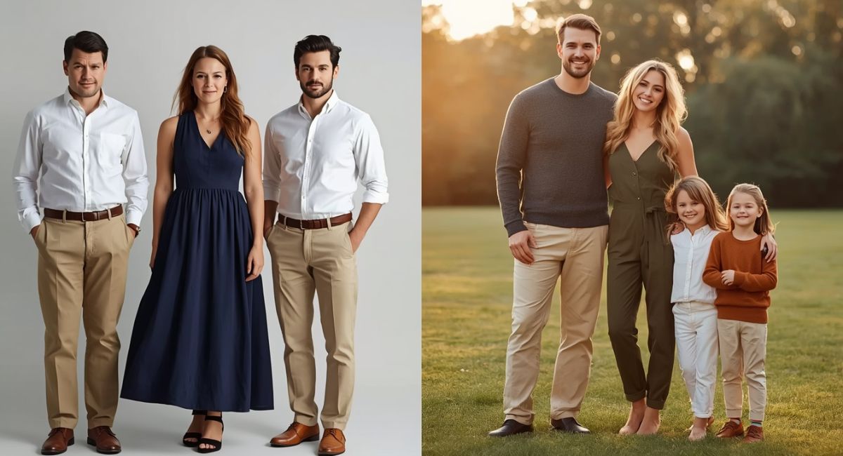
Nothing dates a family photo faster than matching outfits. Matching colors create a flat, costume-like appearance where individual faces disappear into a sea of identical fabric. The better approach? Coordinated colors that complement without copying. This strategy keeps each person distinct while the group still looks intentionally styled together.
Professional photographers cringe at matching outfits. The Professional Photographers of America reports that identical clothing removes depth, dimension, and personality from group portraits. A family where everyone wears the same white shirt and khaki pants looks like a catalog display rather than a real family. The question should everyone wear the same color for family photos comes up constantly. The answer is a firm no. Instead, choose a palette of 3-4 coordinating shades and assign them across the group. For complete wardrobe planning, Explore:
1. Matching Colors Erase Individual Personalities
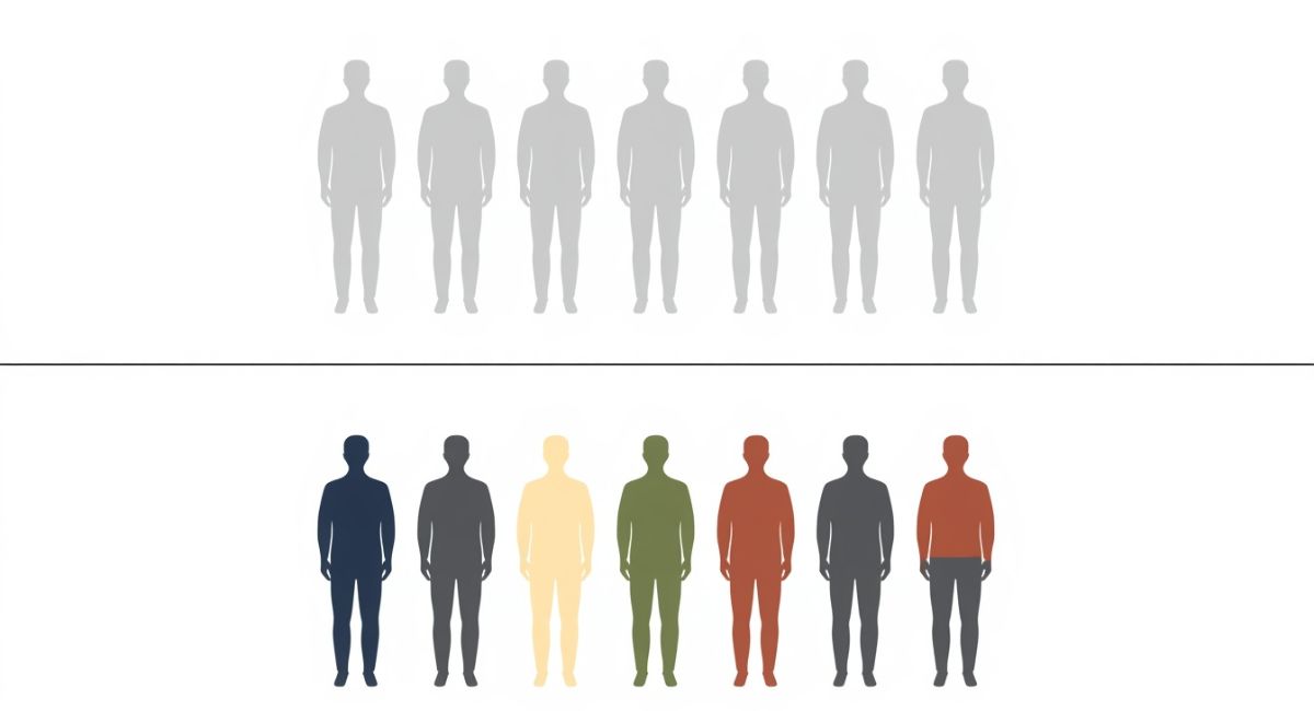
Identical outfits strip away what makes each person unique. A matching red polo on dad looks the same as on a toddler. Grandma disappears into the same navy sweater as everyone else. The viewer’s eye cannot distinguish between family members when clothing offers no visual clues.
Matching colors also flatten the image’s depth. When everyone wears the exact same shade, the group blends into a single two-dimensional blob. Should everyone wear the same color for family photos if they want a timeless result? No. Each person deserves clothing that reflects their age, role, and personality within the family unit.
Coordinated colors preserve individuality. Dad wears charcoal. Mom wears cream. Teen daughter wears navy. Young son wears olive. Different but connected. Each person stands out while the group still feels cohesive. Find coordination inspiration in:
2. Matching Colors Remove Visual Hierarchy
Great photographs guide the eye. The viewer should look at one person first (usually the center or the parent), then explore the rest of the group. Matching outfits destroy this hierarchy. The eye bounces randomly because everyone looks identical.
Should everyone wear the same color for family photos if they want the grandparents to stand out? No. Grandparents deserve different colors that honor their position in the family. A burgundy sweater on grandma and charcoal cardigan on grandpa distinguish them from parents and children.
Visual hierarchy through color tells the story of your family. Parents in slightly darker or richer colors become anchors. Children in softer or brighter shades feel energetic and youthful. Grandparents in warm traditional hues communicate wisdom and warmth.
Learn more about color psychology in:
How to Create Visual Hierarchy With Color
| Family Member | Suggested Color Role | Example |
|---|---|---|
| Parents/Center | Darkest or richest shades | Navy, charcoal, burgundy |
| Children | Medium or brighter shades | Sky blue, cream, olive |
| Grandparents | Warm traditional shades | Camel, rust, deep teal |
| Babies/Toddlers | Soft light shades | Blush, powder blue, cream |
3. Matching Colors Look Dated and Costume-Like
Open any family photo album from the 1990s. You will see matching denim shirts, matching white turtlenecks, matching khaki shorts. Those photos look hilarious now. Should everyone wear the same color for family photos if they want images that last decades? Absolutely not.
Matching outfits anchor your photos to a specific trend or moment. Coordinated colors transcend time. A family wearing cream, navy, and olive in 2026 will still look stylish in 2046. The same family wearing identical beige sweaters will look frozen in a 2026 trend.
Timeless family photos rely on classic colors worn differently by each person. One person wears navy dress. Another wears cream cardigan. A third wears olive pants. These colors never go out of style. They work across decades. Find timeless combinations in:
- Fall Color Palette for Family Photos: 2026 Guide to Warm Stunning Tones
- What Colors Make You Look Thinner in Photos? 7 Slimming Hues That Work Instantly
4. Coordinated Colors Create Visual Interest
Texture variety adds another layer to coordinated outfits. A cream cable-knit sweater looks completely different from a cream silk blouse even though both are cream. This texture contrast adds richness that matching outfits cannot achieve.
Pattern mixing works within coordinated palettes. One person wears navy and cream stripes. Another wears solid cream. A third wears navy polka dots. The colors connect. The patterns differentiate. Should everyone wear the same color for family photos if they want visual depth? No. Patterns and textures create that depth naturally.
Layering becomes possible with coordinated colors. A charcoal blazer over a cream top over navy pants creates multiple visual layers. Matching outfits eliminate layering because everyone looks flat and one-dimensional. Explore layering ideas in:
- Engagement Photo Outfits: Stunning Couples Guide for Picture-Perfect Memories
- Senior Picture Ideas 2026: Outfits Poses and Locations That Wow
5. The Right Way: A 3-4 Color Palette for the Whole Family
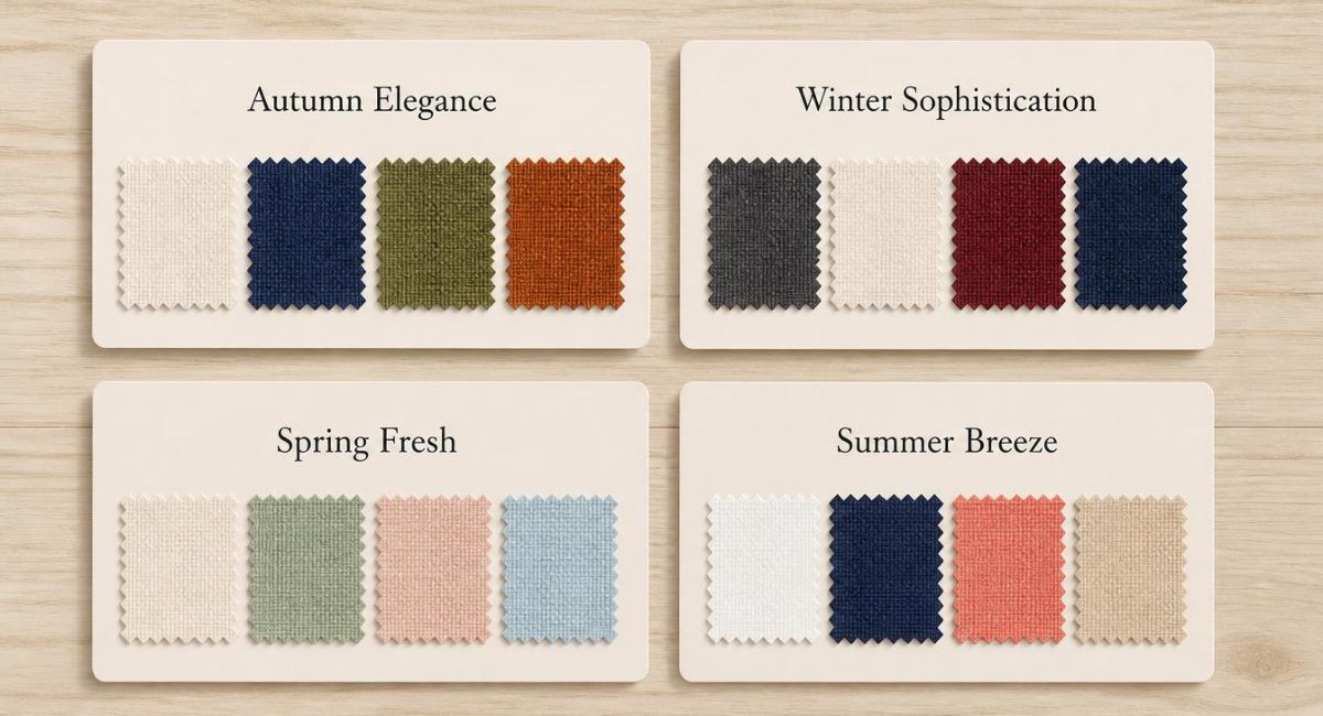
Step 1: Choose 3-4 colors that work well together. Classic palettes include:
| Palette Name | Colors | Best For |
|---|---|---|
| Autumn Elegance | Cream, navy, olive, rust | Fall family photos |
| Winter Sophistication | Charcoal, cream, burgundy, navy | Winter indoor sessions |
| Spring Fresh | Cream, sage, blush, sky blue | Spring outdoor portraits |
| Summer Breeze | White, navy, coral, beige | Beach or lake sessions |
Step 2: Assign colors differently to each person. No two people wear the exact same combination.
Step 3: Add one accent color (optional) through small accessories.
Should everyone wear the same color for family photos after reading this? No. Assign colors like this instead:
| Family Member | Main Color | Secondary Color | Accent |
|---|---|---|---|
| Mom | Navy dress | Cream cardigan | Gold necklace |
| Dad | Charcoal sweater | Navy pants | Brown belt |
| Teen daughter | Olive jumpsuit | Cream scarf | Burgundy hair tie |
| Young son | Cream button-down | Navy shorts | Olive sneakers |
Notice how all four colors (cream, navy, olive, charcoal) appear across the group, but no one wears them identically. This is coordinated perfection.
For seasonal applications, explore:
- Spring Family Photo Outfits 2026: Fresh Stylish Ideas for Blooming Portraits
- Summer Family Photo Outfits: Light & Airy Styles That Photograph Beautifully (2026)
- Fall Family Photos: Stylish Outfit Ideas That Look Stunning & Elegant
- Winter Family Photo Outfits: Cozy Elegant Looks That Keep You Warm and Photogenic
6. Quick Reference: Matching vs Coordinated
| Aspect | Matching Outfits | Coordinated Outfits |
|---|---|---|
| Visual appeal | Flat, costume-like | Rich, dimensional |
| Individuality | None | Each person distinct |
| Timelessness | Dates quickly | Lasts decades |
| Visual hierarchy | None | Clear focal points |
| Texture variety | None | Rich texture mixing |
| Professional look | Amateur | Polished |
7. The Bottom Line
Should everyone wear the same color for family photos? No. Never. Matching outfits erase personality, destroy visual hierarchy, look dated, and remove all visual interest. Instead, choose 3-4 coordinating colors. Assign them differently to each person. Add texture and pattern variety. The result will be timeless, professional, and uniquely your family.