
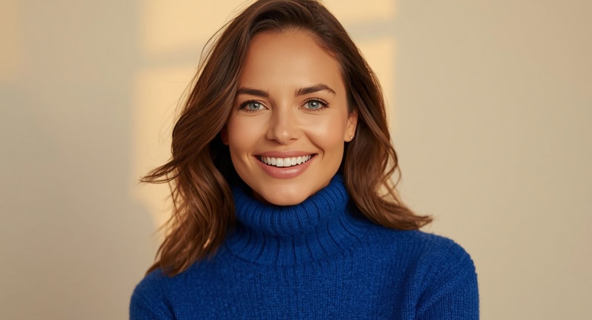
Photographers agree on one surprising answer. Blue consistently ranks as the most photogenic color across thousands of portrait sessions. From navy to sky blue, this versatile hue complements every skin tone, flatters all ages, and performs beautifully in any lighting condition. The reason lies in color psychology and camera sensor technology.
Blue creates a psychological response that other colors cannot match. According to research published in the journal Frontiers in Psychology, blue consistently ranks as the world’s favorite color across 40 different countries. This universal preference translates directly to photography. Viewers naturally feel more positive toward images featuring blue clothing. A royal blue dress or navy blazer makes the subject appear more trustworthy, calm, and visually appealing.
For complete wardrobe planning, Explore:
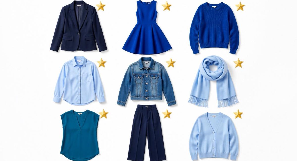
1. Blue Complements Every Skin Tone
No other color works across the entire spectrum of human complexion. Navy blue adds depth to fair skin without washing it out. Royal blue makes medium and olive skin tones appear vibrant and warm. Sky blue brightens darker skin tones beautifully without looking harsh or artificial.
Powder blue softens older skin by reducing the appearance of fine lines and wrinkles. Sapphire adds a touch of drama for evening portraits. Denim blue works casually for outdoor family sessions. The versatility of blue means one color can outfit an entire family group regardless of individual complexion differences.
Unlike red which can make some skin appear flushed or yellow which adds sickly undertones, blue neutralizes and balances. A blue top near the face acts like a natural filter. It reduces redness, minimizes shadows, and creates an even canvas for the camera sensor. Find seasonal blue combinations in:
- Summer Family Photo Outfits: Light & Airy Styles That Photograph Beautifully (2026)
- Winter Family Photo Outfits: Cozy Elegant Looks That Keep You Warm and Photogenic
2. Blue Performs Beautifully in Any Lighting Condition
Most colors fail in at least one lighting scenario. White blows out in direct sun. Black loses detail in shade. Red shifts strangely under fluorescent lights. Blue maintains its integrity across natural light, golden hour, overcast skies, and indoor studio setups.
Navy blue absorbs enough light to prevent harsh reflections during midday shoots. Sky blue reflects softly during golden hour without creating the radioactive glow of neon colors. Cobalt blue pops against autumn foliage and winter snow alike. Professional photographers consistently recommend blue for clients who book sessions at varying times of day.
The Professional Photographers of America cites blue as the most reliable color for unpredictable outdoor conditions. A blue sweater photographed at noon looks almost identical to one shot at sunset. The color shifts less than any other hue in the spectrum. Learn more about lighting in:
3. Blue Creates Psychological Calm in Viewers
Color psychology plays a massive role in how people perceive photographs. Blue triggers feelings of trust, stability, and calm. Family photos featuring blue clothing feel more harmonious and emotionally balanced. Viewers spend longer looking at images where the subjects wear blue.
Light blue evokes openness and tranquility perfect for spring and summer portraits. Deep blue communicates confidence and sophistication for senior pictures and engagement sessions. Teal (blue-green) adds creativity and uniqueness while maintaining the calming properties of pure blue.
This psychological response explains why blue appears in more professional headshots than any other color. Corporate photographers know that a blue button-down shirt makes executives appear more trustworthy and approachable. The same principle applies to family photos where connection and warmth matter most.
4. Blue Coordinates Effortlessly With Other Colors
The most photogenic color must work well with others. Blue pairs beautifully with almost every hue in the spectrum. Blue and cream creates a classic timeless look. Blue and olive feels natural and organic for outdoor sessions. Blue and burgundy adds sophistication for formal portraits.
| Blue Shade | Best Paired With | Perfect For |
|---|---|---|
| Navy | Cream, olive, burgundy | Fall family photos |
| Royal | White, gray, camel | Spring and summer |
| Sky | Beige, soft pink, lavender | Beach sessions |
| Cobalt | Black, silver, emerald | Evening portraits |
| Denim | White, brown, rust | Casual outdoor shoots |
Blue also acts as a neutral in group photos. One person wearing blue while others wear various colors does not create visual chaos. The blue grounds the image and gives the eye a resting point. This makes blue the ideal choice for large family groups where coordination feels impossible. Learn more about color coordination in:
- Fall Color Palette for Family Photos: 2026 Guide to Warm Stunning Tones
- Why Neutral Family Photo Outfits Always Look Timeless (Pro Photographer Approved)
5. Blue Photographs Well at Any Age
Most colors look different on children versus adults versus seniors. Blue works across all age groups without looking costumey or inappropriate. A baby in blue looks classic and sweet. A teenager in blue appears stylish without trying too hard. A grandparent in blue looks elegant and distinguished.
Soft blue flatters aging skin by reducing the appearance of wrinkles and age spots. Bright blue energizes children and teenagers without overwhelming their smaller frames. Dark blue adds sophistication to adults without the harshness of black.
This age versatility makes blue the safest choice for multi-generation family portraits. Grandparents, parents, and children can all wear different shades of blue and still look cohesive. No other color offers this flexibility. Find seasonal outfits for all ages in:
- Fall Family Photos: Stylish Outfit Ideas That Look Stunning & Elegant
- Spring Family Photo Outfits 2026: Fresh Stylish Ideas for Blooming Portraits
6. The Runner-Up Colors
| Color | Why It’s Photogenic | Best For |
|---|---|---|
| Olive green | Natural, earthy, flatters all skin tones | Outdoor sessions |
| Dusty rose | Soft, romantic, adds warmth | Spring and summer |
| Charcoal gray | Slimming, sophisticated, professional | Headshots and formals |
| Cream | Bright but not harsh, timeless | Any season |
7. Colors That Are Surprisingly NOT Photogenic
| Color | Problem |
|---|---|
| Pure white | Blows out, loses detail |
| Neon yellow | Creates radioactive glow |
| Hot pink | Casts pink light on faces |
| Bright red | Overpowers everything |
8. How to Wear Blue for Maximum Impact
Monochrome blue creates a striking sophisticated look. Navy pants with a sky blue top keeps the eye moving vertically. Blue as an accent works for those hesitant to commit. A blue scarf, blue shoes, or blue handbag adds the photogenic benefits without full commitment.
Blue near the face matters most. A blue top or dress influences skin tone more than blue pants or shoes. Prioritize blue on the person closest to the camera or the person standing in the center of group shots.
Avoid neon blue or electric blue shades. These reflect unpredictably and create the same problems as other neon colors. Stick with navy, royal, sky, cobalt, and denim for reliable results. For posing tips that complement blue clothing, read:
9. The Bottom Line
Blue is the most photogenic color because it complements every skin tone, performs in any lighting, creates psychological calm, coordinates with everything, and works at any age. Navy blue offers the most reliable results. Royal blue adds vibrancy. Sky blue brightens without washing out. Choose blue for your next family photo and watch the difference.