
Choosing the wrong color to wear in photos is one of the most common and most avoidable mistakes people make before a photoshoot, and the consequences show up immediately and permanently in the final images. A color that looks perfectly fine in a mirror or in everyday life can behave completely differently under a camera lens, washing out your complexion, creating distracting glare, clashing with your background, or pulling the viewer’s eye away from your face entirely.
Knowing what colors do not photograph well is not just useful for professional photographers and models. It is practical knowledge for anyone who wants to look their best in family photos, engagement sessions, senior pictures, headshots, video calls, or any other context where a camera is involved. The difference between a flattering photograph and a disappointing one often comes down entirely to color choice, and understanding the specific colors that consistently cause problems on camera gives you the ability to make better decisions every single time.
While choosing colors that photograph well is important, color is only one part of creating a great outfit. The way clothing fits, layers, and works together has an equally large impact on the final image. Our guide on how to style a T-shirt covers simple techniques for making everyday outfits look more intentional, while anyone struggling with oversized denim can also learn how to stop baggy jeans from dragging on the floor without permanently altering them. Small styling adjustments often make a bigger difference in photos than people expect.
This guide covers the seven colors that most consistently photograph poorly, explains exactly why each one causes problems on camera, breaks down how lighting conditions change which colors are most problematic, addresses video call and ring light specific color issues, and provides a clear alternative for every color to avoid so you always know what to wear instead.
1. Neon Yellow and Neon Green
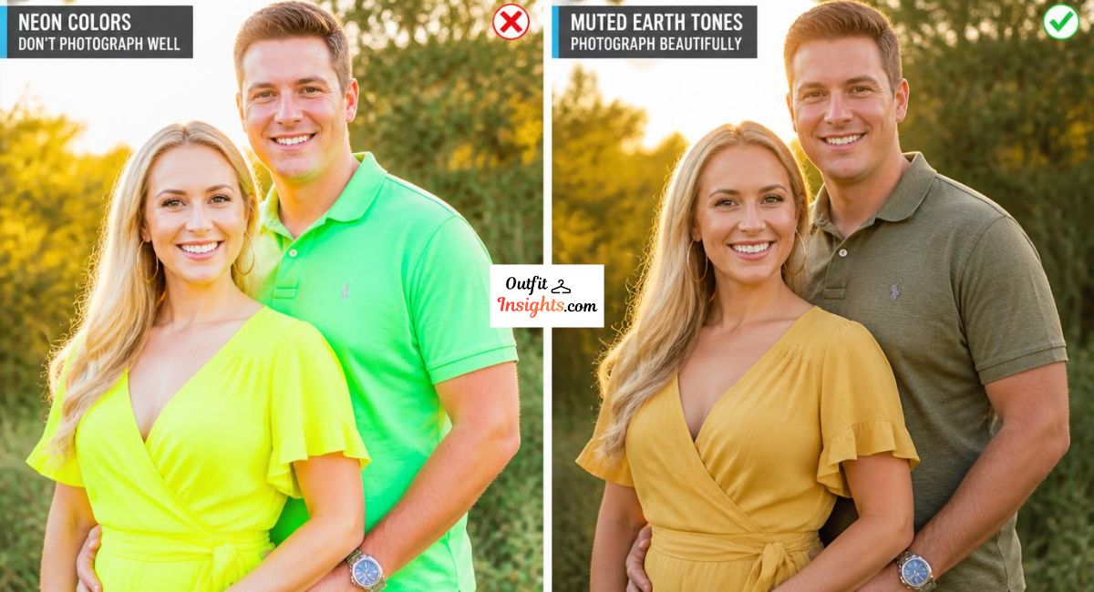
Neon yellow is consistently ranked as one of the single most difficult colors to photograph well across all camera types, lighting conditions, and skin tones. The reason comes down to how camera sensors process extremely high-saturation colors at the bright end of the visible spectrum.
Neon yellow reflects an overwhelming amount of light back toward the camera sensor. This causes the camera’s automatic exposure system to compensate by underexposing the rest of the frame, which means your face, your background, and every other element in the photograph gets darker and loses detail while the neon fabric itself still looks blown out and overexposed. The result is a photograph where the clothing dominates the entire visual field and everything else suffers for it.
Neon green causes similar problems with an additional complication. Green is the color channel that digital camera sensors are most sensitive to because of how Bayer filter arrays in digital cameras are structured. This means neon green can bleed color into adjacent areas of the photograph, casting a greenish tint onto nearby skin tones and creating a color accuracy problem that is difficult to correct in post-processing.
What to wear instead: Soft olive green, sage green, muted chartreuse, or warm yellow tones like mustard and golden yellow all provide the warmth and energy of the yellow-green spectrum without the overexposure and bleeding problems of their neon counterparts.
2. Pure Bright White
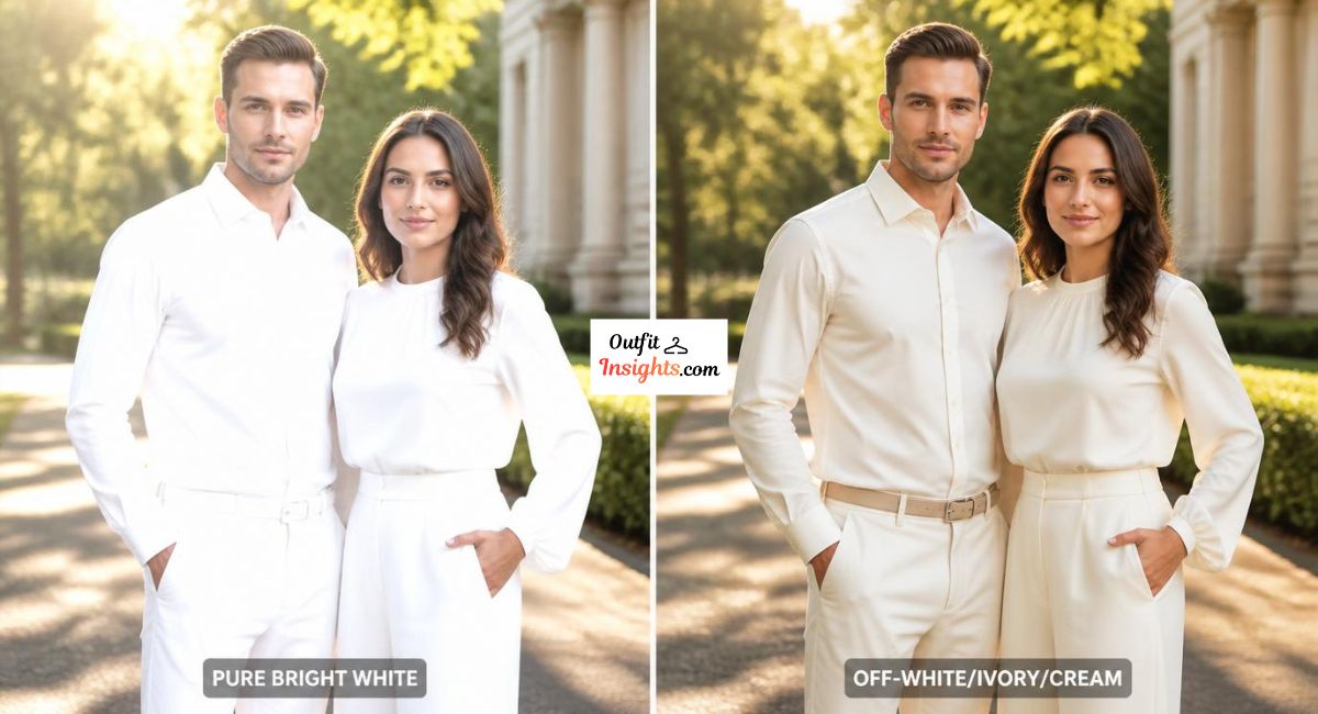
Pure bright white is one of the most counterintuitive entries on this list because white feels clean, fresh, and photogenic in a general sense. In reality, pure white is one of the most technically challenging colors for cameras to handle correctly, particularly in outdoor settings and under direct flash.
The problem with bright white in photography is called clipping or blown highlights. Camera sensors have a finite range of brightness values they can capture simultaneously. When a pure white garment is in the same frame as a human face, the camera struggles to expose correctly for both at the same time. If the camera exposes for the face, the white clothing overexposes and loses all texture and detail, appearing as a flat, featureless expanse of brightness. If the camera exposes for the white clothing, the face becomes too dark.
Experienced photographers can manage this problem with careful lighting setups, but in natural light outdoor photography, in automatic camera modes, and in everyday phone photography, pure white consistently causes exposure problems that result in flat, washed-out photographs.
What to wear instead: Off-white, ivory, cream, and warm champagne tones all read as white in photographs while retaining texture and dimension under varying light conditions. These alternatives give you the clean, fresh quality of white without the overexposure problems.
For more guidance on how specific colors behave in outdoor photography conditions, our guide on best colors for family pictures outside covers outdoor color behavior in detail.
3. Jet Black in Low Light Settings
Black is a sophisticated, slimming, and widely worn color that photographs beautifully in many conditions. However jet black in low light settings or against dark backgrounds creates a specific and consistent problem that is worth understanding before choosing it for a photoshoot.
In low light conditions, black clothing absorbs nearly all available light and reflects almost none back toward the camera. This causes black garments to lose all texture, detail, and dimension in photographs, appearing as a flat, featureless dark mass rather than a piece of clothing with structure and fabric detail. The visual effect is that the person appears to have no lower body definition, with their face floating above a dark void.
The problem is compounded when the background is also dark. Without contrast between the clothing and the background, the subject loses visual separation from their surroundings and the photograph looks flat and undefined regardless of how well the face is exposed.
What to wear instead: Deep charcoal, rich navy, dark forest green, and deep burgundy all provide the sophistication and slimming effect of black while retaining enough light reflection to maintain texture and dimension in photographs across a range of lighting conditions.

4. Hot Pink and Magenta
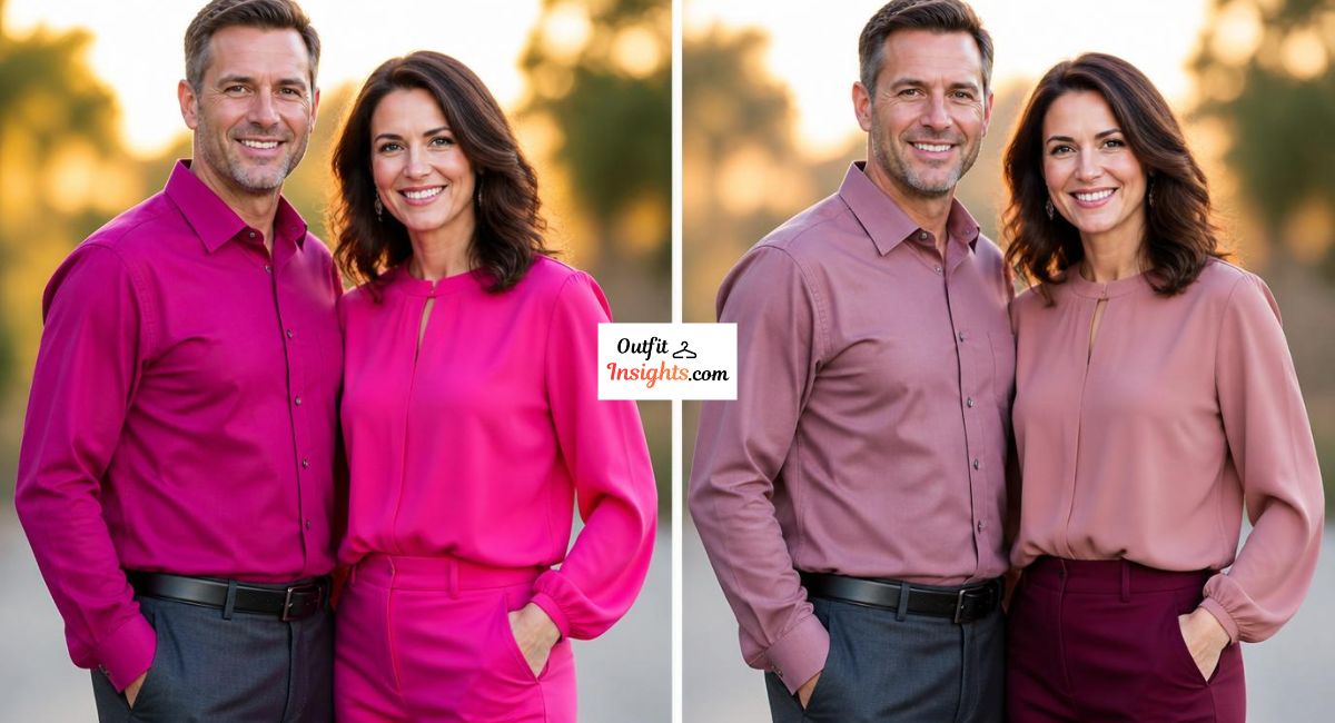
Hot pink and magenta are colors that photograph with a specific and very noticeable problem called color casting. These highly saturated colors in the pink and magenta range reflect their color wavelengths not just back toward the camera but also onto nearby surfaces, including human skin.
When someone wears hot pink near their face, the color reflects onto their chin, neck, and lower face, creating a pink or magenta tint on the skin that is immediately visible in photographs and extremely difficult to correct in editing without affecting the overall color accuracy of the entire image. This color casting effect is particularly pronounced in outdoor settings and under flash photography where light bouncing off clothing surfaces is unavoidable.
Beyond the skin casting problem, hot pink and magenta are colors that cameras tend to render with less accuracy than most other hues, often shifting toward either an orange-pink or a purple-pink depending on the camera’s white balance settings and the ambient light color temperature.
What to wear instead: Dusty rose, muted blush, soft mauve, and deep berry tones all provide the feminine warmth and personality of the pink spectrum without the color casting and accuracy problems of their saturated counterparts. These muted alternatives consistently photograph with warmth and elegance.
Our article on what is the most photogenic color covers the full spectrum of colors that consistently perform well on camera and explains the photography science behind why certain tones are naturally more flattering.
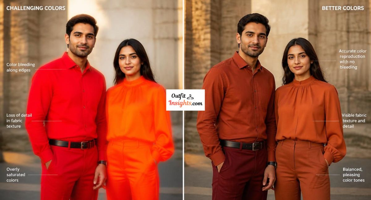
5. Bright Red and Vivid Orange
Bright red and vivid orange share a specific photography problem that stems from how digital camera sensors handle colors at the warm end of the visible spectrum. Both colors are prone to what photographers call chroma clipping or saturation clipping, where the color becomes so intensely saturated in the final image that it loses all gradation and texture and renders as a flat, uniform block of color.
Bright red has the additional problem of bleeding, where the color appears to slightly extend beyond the physical boundaries of the garment in the photograph, creating a subtle but noticeable halo effect around red-colored clothing. This is particularly visible in photographs with light or neutral backgrounds where the contrast makes the bleeding effect more apparent.
Vivid orange tends to shift in color accuracy under different lighting conditions, appearing closer to red in warm-toned lighting and closer to yellow in cool-toned lighting, making it a color that rarely renders accurately in photographs regardless of the lighting setup.
What to wear instead: Terracotta, rust, burnt orange, deep brick red, and warm burgundy all provide the warmth and energy of the red-orange spectrum while rendering with the color accuracy and texture detail that their vivid counterparts lack.
6. Busy Patterns and Fine Stripes
While not strictly a color, busy patterns and fine stripes deserve inclusion in any guide about what does not photograph well because they cause some of the most visually disruptive problems in photography of any clothing choice.
Fine stripes, houndstooth, tight geometric patterns, and small repeating prints create what photographers call a moiré effect on camera. This is an optical interference pattern that causes the fabric to appear to shimmer, ripple, or vibrate in the photograph, creating a distracting visual artifact that has nothing to do with how the garment actually looks in person. The moiré effect occurs because the repeating pattern of the fabric interacts with the pixel grid of the camera sensor, creating an interference pattern that the camera cannot accurately resolve.
Large, bold graphic prints cause a different but equally problematic issue. They draw the viewer’s eye immediately and persistently toward the clothing graphic rather than toward the person’s face, which works directly against the purpose of almost every type of portrait photography.
What to wear instead: Solid colors, subtle textures like fine knit or woven fabric, and widely spaced simple patterns all photograph cleanly without moiré interference or graphic distraction.
For specific guidance on what colors and patterns work best in family photo contexts, our comprehensive family photo outfits guide covers coordinated outfit planning in detail.

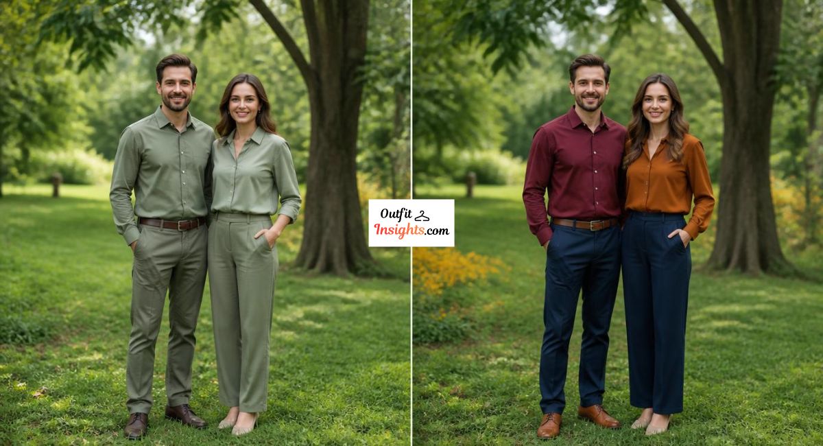
7. Colors That Exactly Match Your Background
The final category of colors that photograph poorly is less about a specific hue and more about a specific relationship between your clothing color and your background. Wearing a color that closely matches your shooting background causes you to visually merge with the environment, losing the separation and presence that makes a compelling portrait.
This problem is most commonly encountered with green clothing in outdoor settings, where green garments blend into grass and foliage backgrounds, and with grey or beige clothing in studio settings where neutral backgrounds closely match neutral clothing tones. The result in both cases is a photograph where the subject appears flattened and lacks the visual pop and dimensionality that contrast between subject and background creates.
What to wear instead: Choose clothing colors that create deliberate, complementary contrast with your expected background. Earth tones against green outdoor backgrounds, rich jewel tones against studio neutrals, and warm tones against cool-toned architectural backgrounds all create the visual separation that makes subjects stand out clearly and compellingly in photographs.
8. How Lighting Conditions Change Which Colors Are Most Problematic
One of the most important and most overlooked aspects of color photography behavior is that the same color can photograph completely differently depending on the lighting conditions under which it is captured. Understanding how lighting changes color behavior helps you make smarter decisions about what to wear in specific photoshoot contexts.
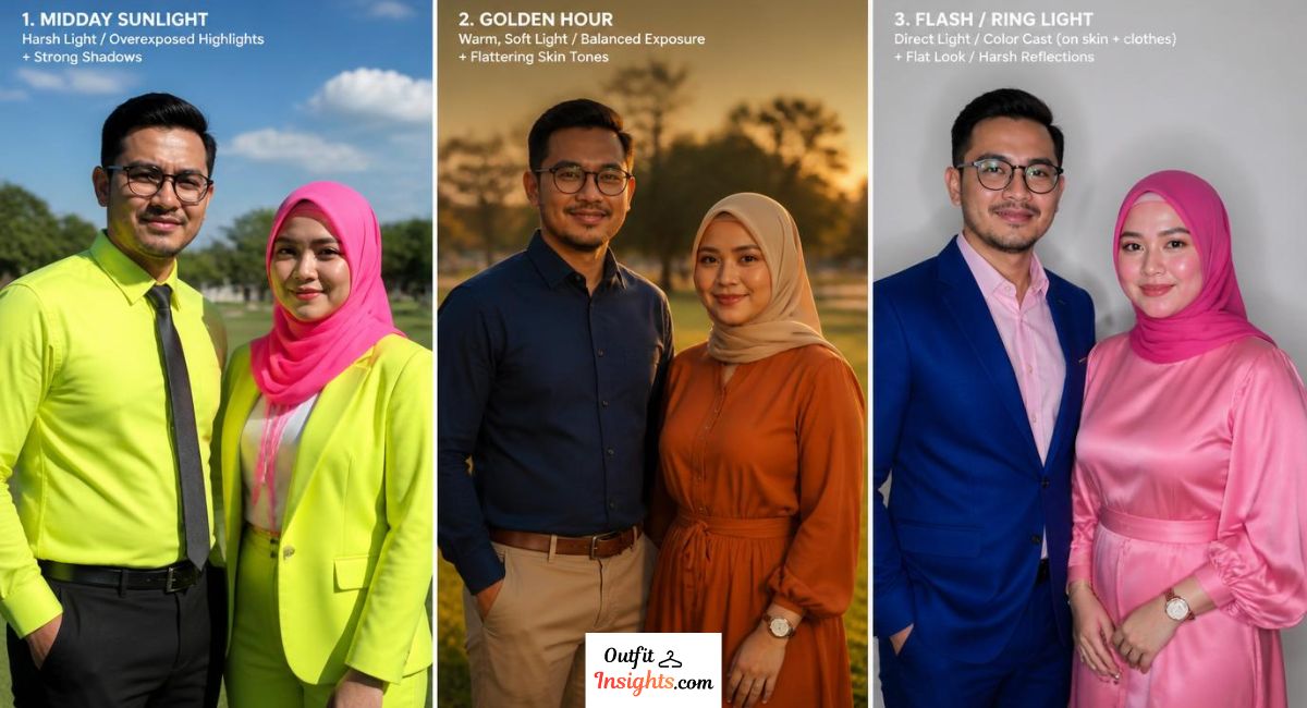
Natural Outdoor Light
Natural outdoor light during midday is the harshest and most color-revealing light source in photography. Under direct midday sun, oversaturated colors like neon, bright red, and hot pink reach their maximum exposure problems because the strong, direct light amplifies the reflectivity of highly saturated fabrics. Colors that might be manageable in softer light become genuinely problematic under direct midday sun.
Golden hour light, the warm, low, directional light in the hour before sunset, is the most forgiving light source for a wide range of colors. Even colors that are slightly too saturated for ideal photography can look beautiful under golden hour light because the warm color temperature of that light softens oversaturation and adds a flattering glow to almost every hue. Understanding golden hour lighting and how to use it to your advantage is covered in detail in our guide on Why Golden Hour Is the Best Time to Take Pictures Outside (Pro Photographer Secret).
If you’re choosing outfits for a cruise vacation, color selection becomes even more important because you’ll likely be taking photos in bright sunlight, around the pool, during formal dinners, and at tropical destinations. After learning which shades don’t photograph well, it’s worth understanding what to actually pack. Our complete guide to attire for Carnival Cruise explains the dress codes for every occasion and recommends clothing colors that look great both onboard and in vacation photos.
Flash Photography
Camera flash creates a very different set of color problems from natural light. Flash produces a cool, direct, flat light that reveals the full saturation of any color immediately in front of it. Under flash, bright colors that look manageable in softer lighting reach their most problematic behavior. Pure white overexposes most dramatically under flash. Hot pink color casting is most severe under flash. Neon colors reach their maximum overexposure effect under direct flash.
If you know your photographs will be taken with flash, applying an additional level of caution to color choice is worthwhile. Muted, medium-toned, and earth-toned colors all perform significantly better under flash conditions than bright, saturated, or very light alternatives.
Ring Light Photography
Ring light setups, which are widely used in both professional photography studios and home video call environments, create a specific circular catchlight in the eyes and an evenly diffused frontal light that is generally very flattering for faces. However ring lights amplify the color casting problem of hot, saturated colors significantly more than natural light does.
Under ring light illumination, hot pink and magenta clothing casts noticeable pink tones onto the lower face and chin in a way that is immediately visible on camera and very difficult to correct without affecting the overall image. Shiny, reflective fabrics like satin and silk also show ring light reflections directly on the fabric surface under ring light setups in a way that creates distracting circular hotspots across the garment.
9. Colors That Do Not Photograph Well on Video Calls
The rise of remote work and video communication has created an entirely new context in which color photography behavior matters to millions of people. What you wear on a Zoom call, a Teams meeting, a job interview conducted over video, or any other video communication platform is subject to the same color photography principles as any other camera-based context, with a few specific additional considerations unique to the video call environment.
The White Balance Problem on Video Calls
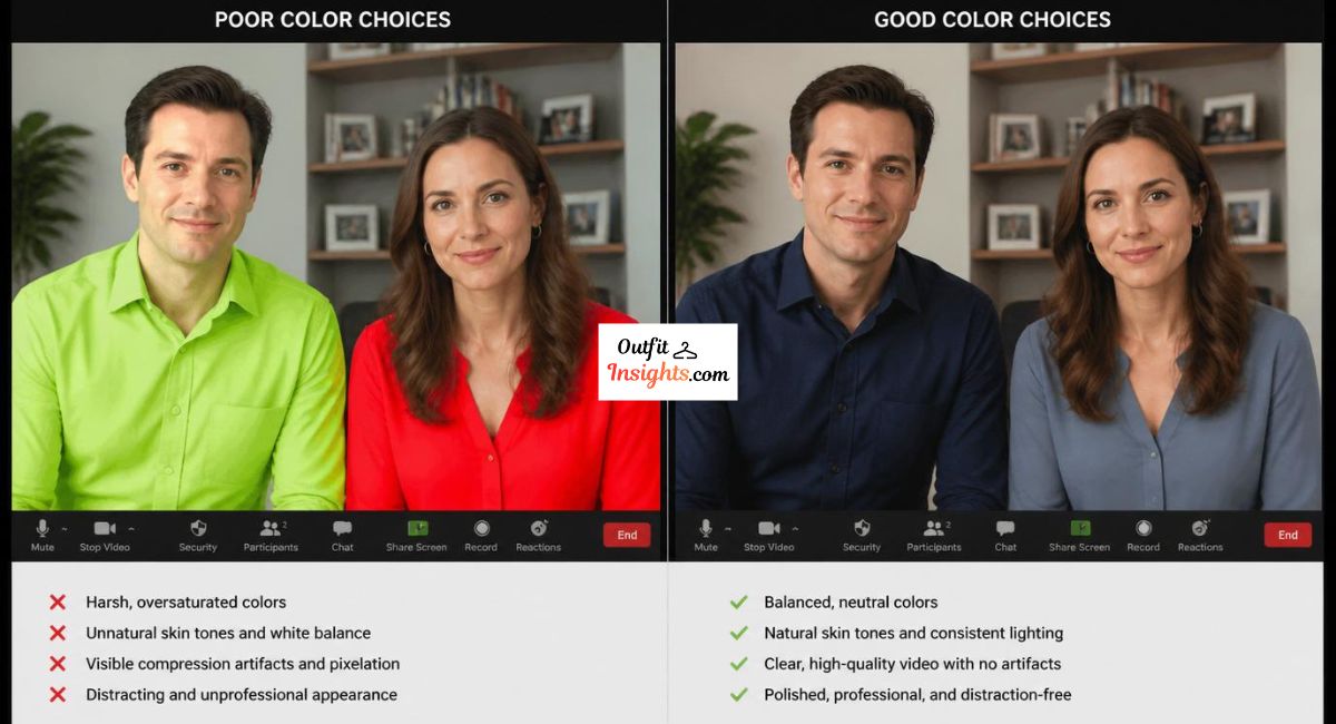
Most video call platforms and webcams use automatic white balance adjustment that continuously shifts during a call based on the dominant colors in the frame. This means that if you are wearing a strongly colored garment, the camera’s white balance system may shift to compensate for that color, creating subtle but noticeable color casts across your face and the rest of the frame that change throughout the call.
This problem is most pronounced with colors at the extremes of the warm and cool spectrum. A very warm orange or red garment can cause the camera to shift toward cooler tones to compensate, making your face appear slightly blue or grey. A very cool blue or purple garment can cause the opposite shift, warming your face unnaturally. Medium-toned colors in the mid-range of the spectrum cause the least white balance disruption on video calls.
Bright Colors and Video Compression
Video call platforms compress video data significantly to transmit it efficiently over internet connections. This compression is applied unevenly across different color ranges, and highly saturated, bright colors are among the most compression-unfriendly choices you can make for video call attire.
Under video compression, neon colors and very bright saturated hues tend to pixelate and artifact around their edges, creating a visually noisy and unprofessional appearance that has nothing to do with your camera quality and everything to do with your color choice. Solid, medium-toned colors compress cleanly and display with consistent quality across all connection speeds and platform compression algorithms.
Best and Worst Colors for Video Calls
| Color | Video Call Performance | Reason |
|---|---|---|
| Navy blue | Excellent | Clean compression, no white balance disruption |
| Charcoal grey | Excellent | Neutral, compresses cleanly |
| Deep teal | Very good | Rich tone, minimal compression artifacts |
| Dusty rose | Good | Soft enough to avoid casting problems |
| Pure white | Poor | Overexposes against most backgrounds |
| Neon yellow | Very poor | Extreme compression artifacts |
| Hot pink | Poor | Severe color casting on face |
| Bright red | Poor | Saturation clipping under compression |
| Fine stripes | Very poor | Severe moiré effect on video |
For specific guidance on what to wear for professional video contexts including job interviews and headshots, our guide on what to wear for a professional headshot covers camera-specific color and outfit principles in detail.
10. Colors That Do Not Photograph Well for Specific Skin Tones
Color photography problems are not universal. The same color can cause very different problems depending on the skin tone of the person wearing it, and understanding this relationship helps you make more personalized and more effective color choices for your specific complexion.
Fair and Light Skin Tones
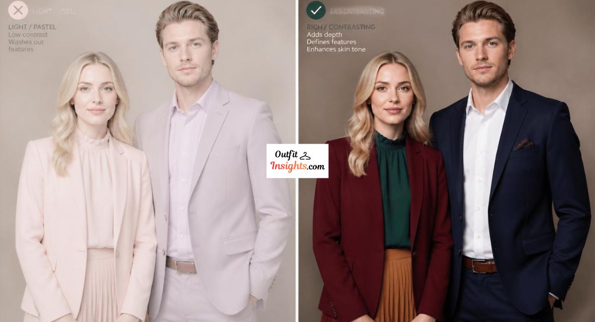
People with fair or light skin tones face the most significant washing-out risk in photography. Colors that are very close to the lightness value of fair skin, particularly pale pastels, light lavender, very light pink, and soft peach, can make fair-skinned subjects appear almost toneless in photographs, with no clear distinction between the face and the clothing. The face needs contrast from the clothing to appear defined and present in a photograph, and very pale colors against very pale skin eliminate that contrast entirely.
The most problematic colors for fair skin tones in photography are light yellow, pale peach, very light pink, and washed-out pastels in general. These colors effectively camouflage a fair complexion rather than framing it.
Most flattering colors for fair skin in photography: Deep jewel tones, rich navy, forest green, burgundy, and warm earth tones all create the contrast that makes fair skin appear luminous and well-defined on camera.
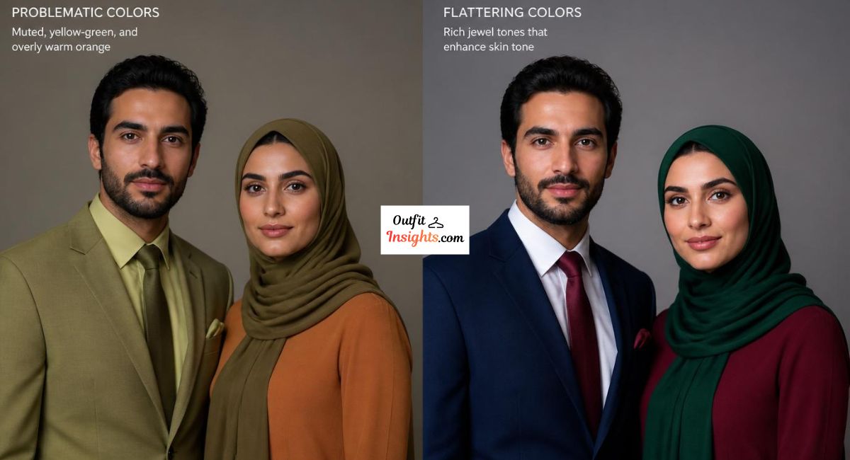
Medium and Olive Skin Tones
Medium and olive skin tones have the most photographic flexibility of any complexion range. They tend to render accurately across a wider range of lighting conditions and color choices than either very fair or very deep skin tones. However certain colors still cause problems.
Muddy, muted yellow-green tones can make olive complexions appear sallow and unwell in photographs by amplifying the yellow-green undertones that naturally appear in olive skin. Overly warm orange tones can have a similar sallowing effect on olive skin under certain lighting conditions.
Most flattering colors for medium and olive skin in photography: Rich jewel tones, deep blues, warm reds and burgundies, and earthy terracotta tones all complement and enhance medium to olive complexions on camera.
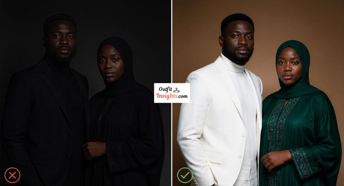
Deep and Dark Skin Tones
People with deep or dark skin tones face a specific and well-documented photography problem that has nothing to do with their color choices and everything to do with how camera systems historically calibrated their exposure algorithms. Many cameras, particularly older models and lower-quality sensors, underexpose deep skin tones by default, creating photographs where facial features lack definition and depth.
In terms of color choice, very dark clothing against deep skin tones can reduce the contrast between face and clothing in the same way that pale colors reduce contrast against fair skin, though the mechanism is different. Very dark navy, black, and very deep charcoal can blend visually with deep skin tones in low light conditions.
Most flattering colors for deep skin tones in photography: Bright white, vivid jewel tones, rich cobalt blue, emerald green, and bold warm tones all create strong, flattering contrast against deep skin tones and produce photographs with excellent visual definition and presence.
Skin Tone Color Guide for Photography
| Skin Tone | Colors to Avoid | Most Flattering Colors |
|---|---|---|
| Fair and light | Pale pastels, light peach, washed yellow | Deep jewel tones, navy, burgundy, forest green |
| Medium and olive | Muddy yellow-green, overly warm orange | Rich blues, warm reds, terracotta, deep teal |
| Deep and dark | Very dark tones in low light | Bright white, cobalt, emerald, vivid jewel tones |
| Cool undertones | Very warm oranges, yellow-greens | Blues, purples, cool reds, silver tones |
| Warm undertones | Icy cool pastels, stark cool whites | Earth tones, warm greens, golden yellow, warm red |
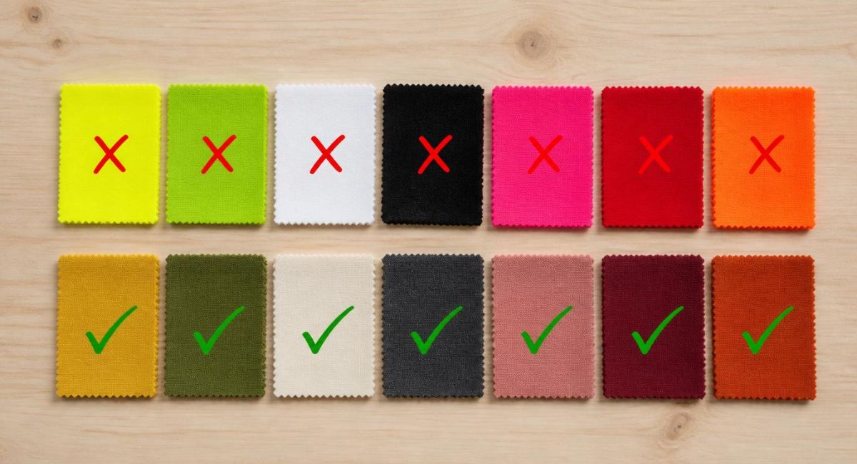
11. Quick Reference: Colors to Avoid and What to Wear Instead
| Avoid This Color | Why It Photographs Poorly | Wear This Instead |
|---|---|---|
| Neon yellow | Overexposes, dominates frame | Mustard, soft yellow, sage green |
| Pure bright white | Blows out highlights, loses texture | Ivory, cream, off-white, champagne |
| Jet black in low light | Loses all texture and dimension | Deep charcoal, dark navy, forest green |
| Hot pink and magenta | Casts pink tones onto skin | Dusty rose, blush, soft mauve, deep berry |
| Bright red | Bleeds and clips saturation | Terracotta, rust, burgundy, brick red |
| Vivid orange | Shifts color under different lights | Burnt orange, warm rust, terracotta |
| Fine stripes and busy prints | Creates moiré effect on camera | Solid colors, subtle textures |
| Colors matching your background | Reduces subject separation | Complementary contrast colors |
Muted colors often photograph more naturally, but they also suit occasions where understated clothing is expected. Dark neutrals like navy, charcoal, and black are commonly recommended for memorial services as well. If you’re unsure about appropriate attire, our guide on what to wear to a wake explains what is considered respectful and appropriate.
12. Final Thoughts
When in doubt, stick to mid-tone earthy colors. Olive, cream, navy, rust, and sage work together effortlessly. They never clash. They never date. And they keep faces looking exactly how you want to remember them. The way you perceive yourself in photographs is influenced by much more than lighting, posing, colors, or camera quality. Familiarity, facial asymmetry, lens distortion, and confirmation bias all play a role. Our guide on why you hate photos of yourself explains how these factors shape the way you view your own images and why your photos often look better to everyone else.
FAQs: What Colors Do Not Photograph Well
These frequently asked questions address the most common concerns about what colors do not photograph well, including colors that wash out skin tones, create exposure problems, clash with backgrounds, or appear differently on camera than they do in person. The answers below will help you make better color choices for portraits, family photos, and professional photography.
1. What colors look the worst on camera?
Neon yellow, pure bright white, hot pink, vivid red, and neon green are consistently the worst-performing colors on camera across most lighting conditions and camera types. These colors either overexpose and lose detail, create color casting onto skin, or produce saturation clipping that renders the fabric as a flat block of color without texture or dimension. Muted, medium-toned alternatives in the same color families photograph significantly better in virtually every context.
2. What color should you not wear for photos?
Neon or heavily saturated colors are the most universally problematic choice for photographs. Beyond neon tones, pure bright white in outdoor settings, hot pink near the face, and any color that closely matches your shooting background are the most consistently problematic choices. Fine stripes and busy patterns also cause significant visual distortion problems through the moiré effect and should be avoided regardless of the specific colors involved.
3. What is the hardest color to photograph?
Neon yellow is widely considered the hardest single color to photograph accurately and flatteringly. It overwhelms camera exposure systems, dominates the visual frame, and creates overexposure problems that are difficult to correct in post-processing without affecting the entire image. Highly saturated neon tones across all hues share this problem, but neon yellow is particularly challenging because of how camera sensors weight the yellow-green channel in their exposure calculations.
4. Do patterns photograph badly?
Yes, certain patterns photograph very badly. Fine stripes, houndstooth, tight geometric repeats, and small-scale prints create a moiré effect on camera that makes the fabric appear to shimmer and vibrate in the final image. This optical interference effect is particularly severe in video contexts and under digital photography. Large, bold graphic prints cause a different problem by drawing the viewer’s eye to the clothing rather than to the face. Solid colors and subtle textures are consistently safer choices for any photography context.
5. What colors wash you out in photos?
Colors that wash you out in photos are typically those that closely match your own skin tone value. For fair-skinned people, pale pastels, light peach, very light pink, and washed-out yellow tones can eliminate the contrast between face and clothing, creating a toneless, undefined appearance. For medium skin tones, muddy yellow-green tones can amplify sallowness. Wearing colors that create clear, complementary contrast against your specific skin tone is the most reliable way to avoid the washed-out effect in photographs.
6. What colors look best in outdoor photos?
Earth tones, soft neutrals, and muted jewel tones consistently perform best in outdoor photography. Blush, ivory, sage green, dusty blue, terracotta, warm rust, and muted burgundy all complement natural outdoor backgrounds and respond beautifully to the warm, directional quality of golden hour light. These colors create strong visual separation from outdoor backgrounds without the overexposure and saturation problems of their bright, saturated counterparts.
7. Does black photograph badly?
Black does not photograph badly in all conditions, but it photographs poorly in specific situations. In low light environments, black clothing loses all texture and dimension and appears as a flat, featureless mass. Against dark backgrounds, black reduces subject separation and makes photographs look flat. Under direct flash, very dark black can absorb so much light that it creates a stark contrast problem with the face. Deep charcoal, dark navy, and deep forest green provide similar visual qualities to black while retaining significantly more texture and dimension across varied lighting conditions.
8. What should you not wear for family photos?
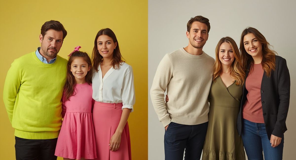
For family photos specifically, avoid neon colors of any kind, pure bright white as a primary color, heavily saturated brights like vivid red and hot pink, busy patterns including fine stripes and small prints, and any color that closely matches your outdoor shooting background. Coordinating the family in soft neutrals, earth tones, and muted jewel tones produces the most consistently beautiful and timeless family photograph results. Our detailed guide on What to wear for family photos covers complete outfit coordination strategies for every season and family size.
The colors you choose for any photoshoot are one of the most controllable variables in how your final images turn out, and the difference between a flattering, timeless photograph and a disappointing one often comes down entirely to this single decision. Understanding what colors do not photograph well gives you the knowledge to make confident choices every time you stand in front of a camera. According to Digital Photography School, color choice consistently ranks among the top three factors that professional photographers advise clients on before any portrait session, which reflects just how significantly this single decision affects photographic outcomes.